 The Stone Roses Remastered album cover is arguably one of the most iconic of its era and still is to this day. I’ve chosen this as an album cover to analyse because its an alternative band, although this isn’t the same genre of our video, it has its similarities.
As with most Stone Roses releases, the cover displays a work by John Squire. It is a Jackson Pollock-influenced piece titled “Bye Bye Badman,” which makes reference to the May 1968 riots in Paris. The cover was named by Q magazine as one of “The 100 Best Covers of All Time.”
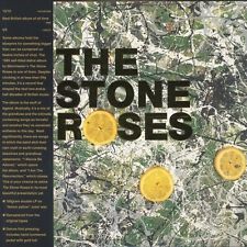
Despite its meaningful reference to the Paris riots i believe that the artwork of the album cover is very attractive and similar to the band its not necessarily a conventional artwork design. Not to feature anyone from the band or a photo relating to the band is unusual on a n album cover, however for this its became almost the face of the band itself. I believe because of its unicity it has become such an iconic picture that represents a whole era and a fashion that was huge at the time and still is now.
The basic conventions of having large bold writing on across the front is simple but one of the most important when trying to make a piece eye-catching and attractive to the viewer. The use of lemons and spilt paint is not only unique and could be described as random it is also for those reasons that it attracts to many people despite them not knowing the meaning behind the art.
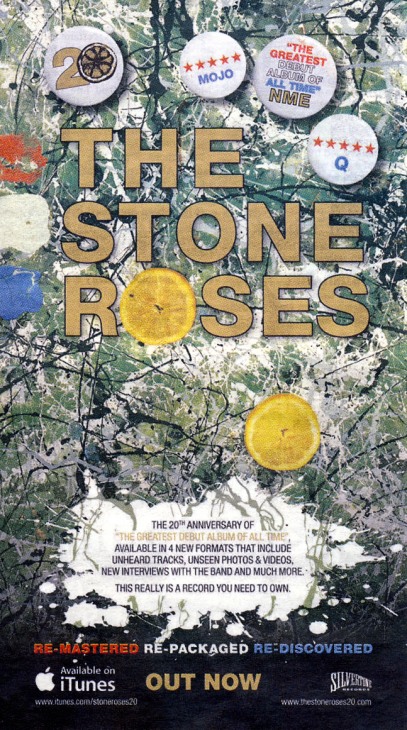
The magazine advert for the album is very conventional. although this is a advert that has been made since the release of the album i think it is probably the best one that has been made for the album. Featuring the album cover as the main photo is common within adverts as it shows the viewer what they are looking for when they want to find it.
The use of the white paint spilt being used to make the text clearer to see is a creative way of the making the advert more attractive and eye-catching. Without this the text wouldn’t be clear enough to see but using this has not affected the design of the cover. Having the iTunes logo in the bottom shows its available there which is a common convention for an advert. Another interesting way of the advertising the album is the use of badges which are quoting different things that promote the album. These again have been used to keep the style of the cover retro and iconic but show the viewer exactly what they need to see.
