
Album advert analysis: The Prodigy Invaders must die

The prodigy are an English electronic dance trio. They have been preforming from 1990 to the present and along with The Chemical Brothers and Fat Boy Slim they have been known as the pioneers of this genre. There six studio albums have been a worldwide successful with XL Records rocketing them into fame. Their main target audience can range from the older original lovers of the 90s when they first began to the new younger generation who made hear some of their songs through parents or at clubs.
This advert is for album 5 ‘Invaders must die’. The artwork has synergy with the album name as along the bottom there is a gathering of people who can only be described as the ‘killers’ of these ‘invaders’. Also the centre piece resembles an spacecraft which hints at invasion, it also feels as if it is coming out at you, much like The Prodigy’s music which could be labelled as ‘in your face’.
The fact the majority of the art is black and white makes the people and the ‘invaders must die’ stand out and create a sense of unity with each other, also the colour similarities construct an ‘us’ vs ‘them’ situation on the advert.
‘The Prodigy’ stands bold and clear at the top, eye catching and the iconic jagged font makes it hard to miss. Perhaps having the name in black indicates they are the invaders, the invasion of their music upon the world, their style of music and performance hint that this may be the case.
This advert isn’t conventional as they usually contain an image of the artist; however following from their other albums The Prodigy decide to allow creative artwork as their selling point for viewers.
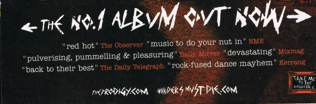
The bottom of the advert contains reviews from respected music magazines and blogs; these are included to even further push the need for this album by indicating that it is widely seen as a good album, which will hopefully increase sales through the readers of those magazines and blogs. The names of the reviewers are also in a different colour to make them stand out immediately.
